Interactive Mapping of Global Generational Suicides
This analysis and interactive visualization is based on this Kaggle CSV dataset, which includes suicides between the years 1985 and 2015 based on World Health Organization suicide statistics. The detailed code for this project can be found in my GitHub repository. This map shows suicides per generation per country on a 100k per-capita basis.
Use the filters on the right to explore the data and change the map:
Project Overview:
The goal of this project was to create an interactive, quick visualization of country-level generational suicides. The map displays country-wide suicides on a per-capita basis per generation. It includes the following generations:
G.I. Generation (born between 1901 - 1927)
Silent Generation (born between 1928 -1945)
Boomer Generation (between 1946 - 1964)
Generation X (born between 1965 - 1980)
Millennials (born between 1981 - 1996)
Generation Z (born between 1997 - 2012)
The dataset includes information from 101 countries, with a focus on Europe, North and Latin America and Asia.
Project Tools:
I used the following tools and languages for this project:
Jupyter Notebook,
Visual Studio Code 1.60.0,
D3 5.5.0,
Python / Pandas,
Javascript,
HTML,
Leaflet 1.7.1,
Mapbox,
Github Pages
Project Findings:
Using the visualization, it quickly becomes apparent that suicide rates are particularly high among older generations and in the former countries of the Soviet Union / Eastern Europe. The map clearly illustrates that older generations are the most at-risk group for suicides, with average per-capita suicide numbers significantly higher for the Greatest Generation (those born between 1901 - 1927), and steadily decreasing the younger the generation gets.
Project Summary:
Reading in the data showed several columns not relevant for my analysis, including many null values, as well as country entries for each generation during each year.

I started by dropping unwanted columns, and calculating the average per-capita suicides by country.
# calculate per-country mean
suicide_mean = pd.DataFrame(suicide_df['suicides/100k pop'].groupby(suicide_df['country']).mean())
I then performed summary statistics to determine the range of data points I would have to take into account for my visualization.

Using Pandas’ groupby() function, I then grouped the per-capita suicides by country and generation:

Visualization:
To visualize the dataset I used Mapbox, which provides 200,000 free tile requests, to create a tile layer. The access token, or API key, used in the code is URL-restricted, meaning it does not work on any other website.
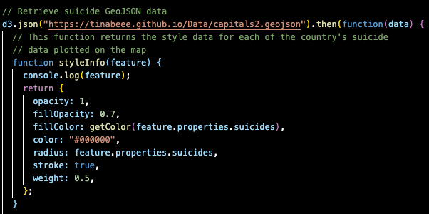
I also adapted this GeoJSON dataset, which includes the coordinates of world capitals, to include suicide rates for the countries in my dataset. I hosted my own GeoJSON dataset via GitHub Pages to be able to make API requests to it.
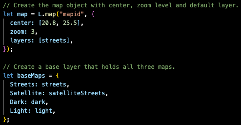
My mapping code centers the map to evenly display all continents and creates four base layers to change the style of the map:
I then added a second layer for the different generation and displayed the new layers as a second overlay object on the map:

Using d3, I make an API request to the GeoJSON dataset I previously uploaded via Github Pages and add style functions, including color, radius size, etc. to each bubble on the map (detailed code can be found in the repo):
I then create a popup marker for each bubble on the map to display country name and suicide rate:
